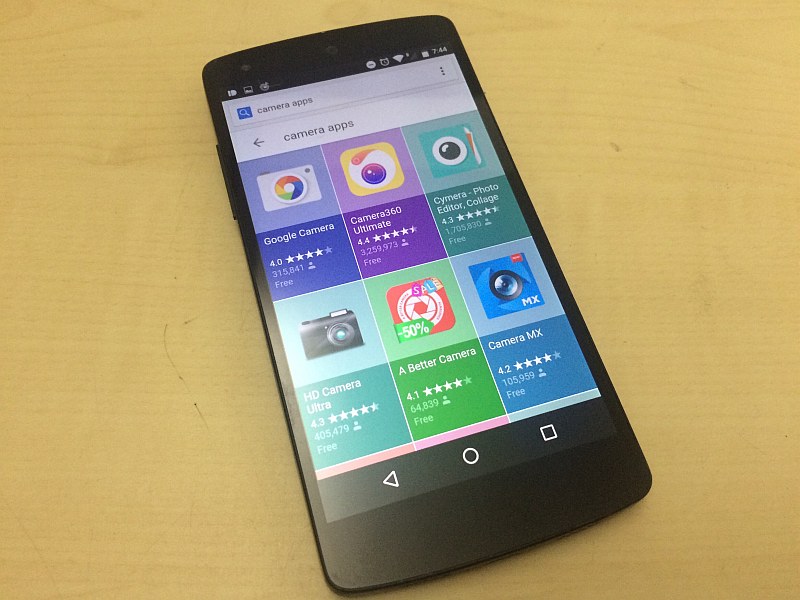
Google is making it easier than ever to find Android apps through searches. A new update changes the way apps entries appear in the search results when you look for a particular kind of app – say rpg games, or music apps – on Google Now or Chrome (for now) on your Android device. Instead of catering a number of Web links to you, the company is now offering users results in a grid of six apps under the Apps section.
Clicking on the section opens a wider list of apps. Clicking on any entry takes you to its corresponding Google Play link, as you would expect. The search result also follows Material Design guidelines, which the company has been aggressively bringing across all of its apps and services.
The update, which seems to be gradually rolling out to Android users, lists down entries that are placed next horizontally and vertically to each other, replacing the earlier list view of a few relevant apps in search results. Interestingly, if users click on the Apps tab (on top in Chrome, and the bottom in Google Now) to filter search results, they are shown app results in the earlier list form.
The move could significantly improve user experience as it genuinely improves apps discovery. And for those who don’t like this feature, the regular search results and other sections follow right after (and in some cases before as well) the Apps section in results. The change is only on Android, and is aimed at easier search to app install conversions.
The move could be Google’s way to tone down how it shows ads, or allegedly favours its own apps over rivals’. The company has been criticised for prominently showcasing its own apps in the search results on Google, and also make it mandatory for all AOSP, GSM partners to install a number of apps on Android devices they ship. These practices have landed the company to the receiving end of a long time investigation by the European commission antitrust. A verdict of which is expected by the end of this year.
[“source-gadgets.ndtv”]
